Recently we’ve had a lot of requests from companies looking for a brand refresh. A new logo design here, a complete overhaul there. One of the first questions we ask the CEOs and CMOs that come into Scream Agency is, “What do you like about your current branding, logo, print collateral, etc.” 80% of the time their response is, “Nothing. I just hate it. It’s not working.” Music to my ears.
At the conclusion of our meetings we walk away with a general direction for initial discovery. Most of the time these are feelings, “We want something that is fresh, clean, light, romantic.” or, “We want loud, bold, kick you in the teeth, offensive.” Perfect.
After a brief check-in with the creative team, the first place I go to is my font collection.
Considering I’m an Art Director my relationship with fonts is probably more unhealthy than most. I’ve been collecting fonts for over a decade. The obsession began while creating t-shirt designs for my roommate’s band in LA. We’d come back late night and scour the internet for fonts to use for their next ground-breaking t-shirt project. We never actually made any of the t-shirts and the band has now broken up, but the fonts remain.
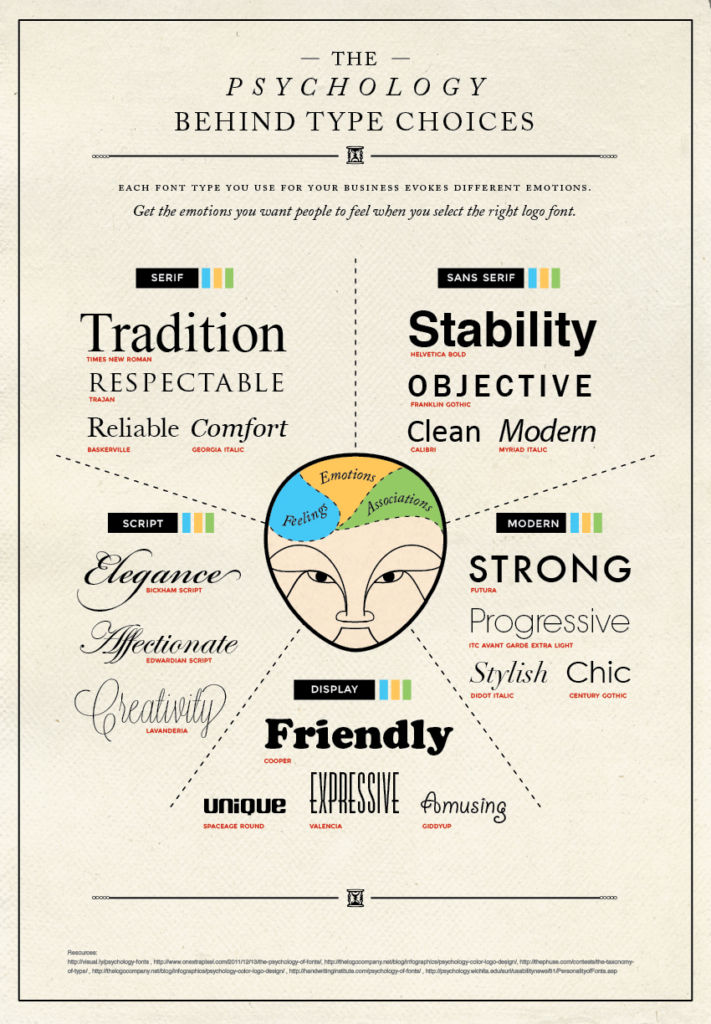
I won’t go into a extensive dissertation on the emotional weight of serif vs sans-serif. But I will tell you is people are judging your business by the look of your font. Are they professional? Are they printer friendly? Have their materials been updated in 20 years? People might not judge a book by it’s cover, but they will certainly judge your brand by it. Armed with the emotional statement from the client the next step is to review the chart below. My printed copy of this thing is littered with additional fonts from years of font searches and false starts, but this is a good place to begin.
Once I’ve selected a font direction the toughest part of the process begins. I pull a collection of fonts that fit the criteria into InDesign and try things. I change weights, kerning, all caps, no caps, colors, etc. It can be exciting, but most of the time it’s just frustrating. Sometimes I find a font that is perfect, but the “J” character just sucks. That’s a no go.
Once I’ve narrowed the font down to my “Favorite Four” I plug them into some sample collateral and build preliminary standards for each of the fonts. I take the time to spell out those standards in the document. This allows the client to react to each of the fonts and speak intelligently about how they want to alter them. Instead of getting notes like, “I want it bigger.” or, “It needs to be fatter.” I get responses like, “Let’s increase the headline size to 48 points instead of 36 points.” or, “Let’s change the weight of the all the body text to bold.” The additional time spent will create transparency in the design process, help educate the client and will save time and money in the creation of the new brand experience.
If you’re in the market for a refresh, do your research. Find out what you competitors are using. Try different fonts. Ask random strangers what they think about your logo. You will most likely get a brutally honest response.
What does your font say about your brand? Give us a call and we can talk about it. 303-893-8608
In the mean time here are some resources to help you get started.
Google Fonts: https://www.google.com/fonts
Dafont.com: http://www.dafont.com
1001 fonts: http://www.1001freefonts.com

